 Wesley Hilliard
A mockup shared by a leaker with a poor track record allegedly depicts iMessage in iOS 19 with a redesigned keyboard and circular buttons, but not much else.
Jon Prosser has had a rough couple of years after some incredibly wrong leaks, but he's attempting a comeback. It seems he's willing to stake what's left of his reputation as a leaker on two 2025 releases — iOS 19 and iPhone 17.
The iMessage mockup was shared by Prosser during a Genius Bar podcast. In the episode, Prosser also says that a video featuring iOS 19 leaks was inbound in the coming days, so stay tuned for that.
Several elements make this screenshot appear to be more of a mockup than screenshot. Prosser tends to have his render artists, currently Asher Dipprey, make new mockups based on actual leaks to protect sources.
The iMessage chat itself is likely just a screenshot of a conversation between Dipprey and Prosser, though the timestamps suggest this mockup may have existed since at least February 18. Also, it appears that the FaceTime button was added after the fact, since it lacks any transparency to the photo underneath.
The FaceTime button and back button have a reflective ring around them, and the edge of the keyboard has a similar reflective border. One could assume that light moves slightly when the iPhone is tilted.
These elements stand out as the "redesigned" portions of iMessage, though there are other tweaks. More on those in a moment.
Prosser shows the mockup at the 43 minute mark.
First, Apple Vision Pro does have rounded buttons that feature a light bouncing off of one edge — especially in the keyboard. However, the effects are much more subtle than what is shown here.
Buttons that stand up in a 3D effect from the UI tend to have shadow gradients under them, and the FaceTime and back button on visionOS iMessage are not 3D. Since the virtual keyboard is its own window, it gets its own outer edge chrome, but even that isn't represented correctly in this mockup.
So, if this is a redesign meant to unify operating systems, Apple would need to change parts of visionOS as well. This does not make it closer to visionOS in nearly any respect.
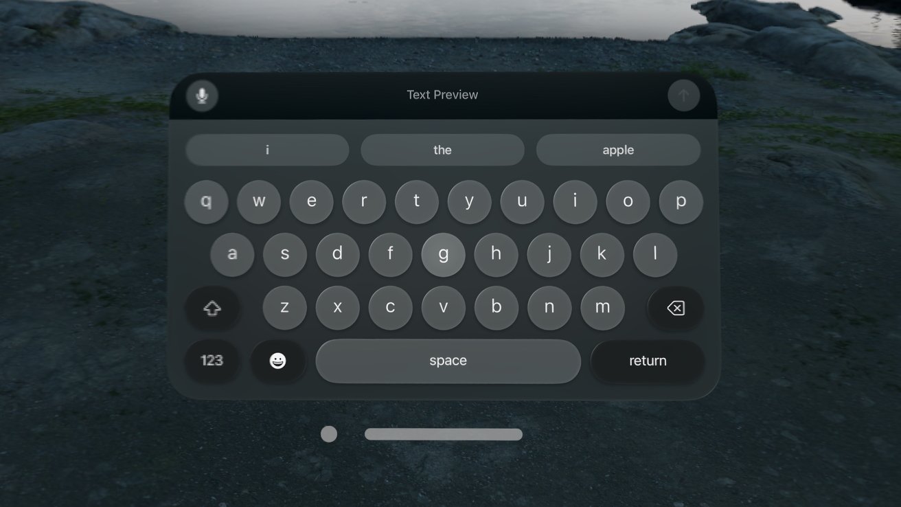 The keyboard in visionOS is distinct from the suggested redesigns in the mockup
According to how the current keyboard works, it seems there are a few oddities with how the mockup was put together. They clearly wanted it to say "Front Page Tech" in the text suggestion, and left the first button highlighted as if the user was pressing on it.
There is no active cursor in the iMessage text field, but one could assume that it is mid-blink, though the Shift key would be highlighted if auto-capitalization was on. Also, the return key is a dark blue for no apparent reason.
It seems highly unlikely that Apple would have such a low-contrast color scheme, even in a dark mode keyboard. The edge of the text suggestion box also doesn't align with the edge of the keyboard properly.
Also, the new glyphs for the emoji and microphone seem like another odd choice. The current ones are filled in and easier to see, especially on phones with smaller keys.
Note also that backspace and shift are inexplicably no longer keys.
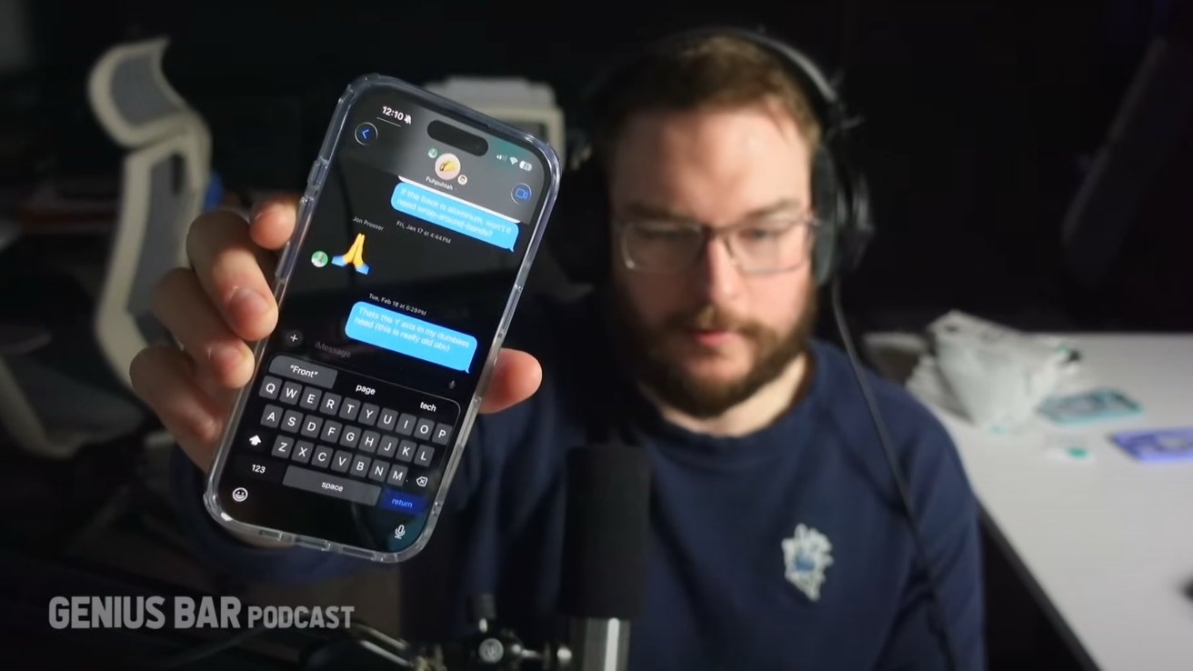 There's a lot of oddities with this mockup. Image source: Genius Bar Podcast
There is a chance that Prosser saw a real screenshot of the new iMessage app and other elements of iOS 19, but this mockup is an odd one. Perhaps it feels unfinished because it is.
There are likely many prototypes and mockups on various apps that go through Apple's development team before landing on a final version. Prosser's original iOS 19 camera interface leak appeared in January, which could mean the version he has is very early.
It has been suggested previously that Apple finalizes operating system updates in December, then spends the next six months getting to developer beta 1.
Prosser mentioned in the podcast that he's heard through the grapevine that engineers at Apple don't fully understand how he has access to finished images. That they've only seen early concepts and not final UI.
Well, that may be because Prosser also only has access to select early sketches or mockups. His render artists are great at creating realistic representations, so perhaps they are landing close to what Apple's developers have made with the same information.
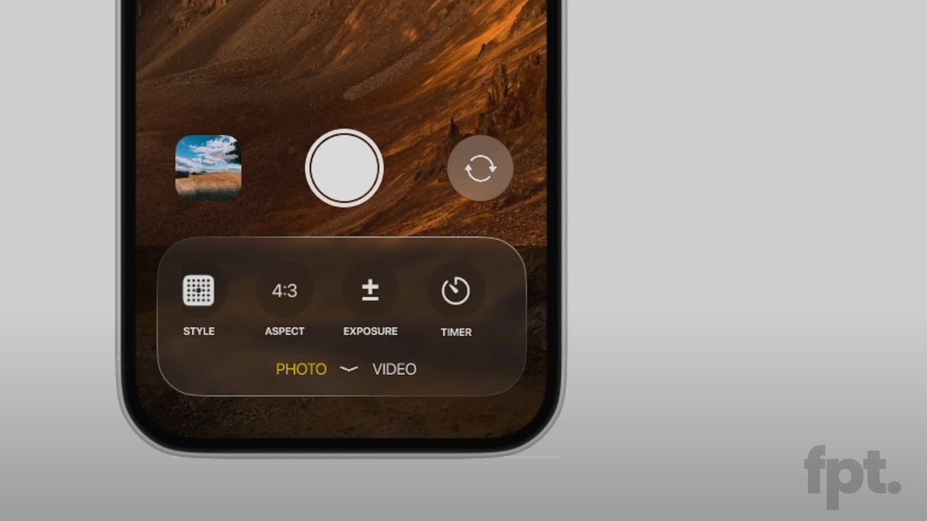 Prosser's earlier iOS 19 camera design leak. Image source: FPT
Looking back at Prosser's earlier Camera app leak, there are some similarities, but odd differences too. The Camera app screenshot shows something much closer to Apple Vision Pro's UI, but lacks the light reflections on button edges.
He also mentioned in the podcast that the overall "redesign" was limited and people expecting something like iOS 7 in scale will be disappointed. The Home Screen is allegedly basically untouched — though the thumbnail for the episode shows a silly mockup with round icons.
Prosser seems to be doubling down on his information this time. It's a great time to try and re-enter the Apple leaks game as major OS redesigns and flashy camera bars are expected.
However, if this ends up being like the colorful MacBook Air redesign rumors, the iPhone 14 retro redesign rumors, or the flat-sides Apple Watch rumors — there will likely be backlash. That said, Prosser will land on his feet thanks to his excellent topical videos on Apple.
Given the WWDC 2025 announcement Tuesday, I expect there will be some new design elements across every operating system. Small tweaks like the ones shown in Prosser's mockup are possible, though, as with any render or mockup, the real deal will likely be better executed.
Prosser's larger iOS 19 leak
Prosser dropped a video only a few hours after the podcast video went live, but on his FPT YouTube page. It showcases elements we discussed in the iMessage app leak earlier, but across other apps.
Rather than write a whole other piece on Prosser's renders, it seemed best to share it here where we've already broke down the iMessage design. The new images do nothing but confirm what we postulated — mockups based on something Prosser has seen with shiny-edged UI elements.
Even the square icons on the Home Screen have the slight glassy look with the light reflection in the corner. Note, too, that the camera UI shown in the new video is subtly different, but likely pops out into the UI Prosser shared previously.
The keyboard also is much more visible in this video and looks much closer to something Apple would ship. However, the blue return key still seems odd.
Whether this is a real design philosophy Apple will take with iOS 19, mockups based on something Apple is no longer pursuing, or a very decent guess from Prosser — that won't be known until June 9.
Update March 25, 7:10 p.m.: Prosser's new video and context added.


-m.jpg)


 Christine McKee
 Marko Zivkovic
 Mike Wuerthele

 Amber Neely
 Sponsored Content


5 Comments
Jon doesn't have any intel. This is his attempt to climb back up to the high dive platform after a few years of flops and busts from his previous fake scoops.
That's a lot of shade being thrown on Jon Prosser, and a lot of assumptions being made. Jon never had any "fake scoops". He reported on things he had been told by insiders he trusted. "Fake" implies he lied. "Mistaken" is not the same thing, especially since Apple has made it clear recently that they themselves don't exactly know what they're doing.
We're still two months before WWDC, so anything Jon may have access to is still going to be early in development. So if these mockups look unfinished and unrefined...yeah, that makes sense. He also mentioned he was turning his screen brightness down for camera, which explains why the shift and backspace don't look like keys. But when you compare them to the visionOS keyboard, they look the same with a significantly darker background than the other keys.
When you take a chance and provide a "first look" at something no one else has seen, I guess you run the risk of people not believing you. When I first saw the new mockups of the 17 lineup, they looked fake to me. But more info keeps leaking which lends credence to them being accurate. You can't really be sure mere minutes after seeing something.
How many times has Gurman been wrong? There's a dude who hasn't had a real "scoop" since he came on the scene before the iPhone 4S. Most of his reporting seems like "logical guesses" based on supply chain info, but no more accurate or trustworthy than others in the "rumor arena". He files a report, the usual suspects print the same exact story about what he said today, and will report the same exact story about what he says in two weeks even when the reports change or are contradictory.
And...that's perfectly fine. No one at AppleInsider or MacRumors or 9to5Mac gets crapped on when they make mistakes. Why hold Prosser to a different standard?
'Twas the 7th Gen. iPod Nano that had circular buttons. When some forum members were deriding Jonathan Ive back then for something, I joked that the real danger was the "roundification" of icons under Ive.
Maybe iOS 19 will be as radically different as iOS 7 was. I'm looking forward to WWDC.
I heard some shaky podcaster with an unhealthy view on Apple’s failure in AI talking about how the US isn’t safe to visit the other day.
People in glass houses…